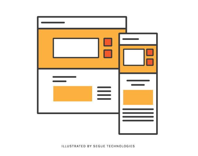
After reviewing web logs and analytics, it was clear to us that mobile users were accessing our website more and more frequently. With a projected 6.1 billion smartphone users by 2020 (source), we needed to make sure the digital door to our company welcomed all visitors and provided the same quality of user experience as our desktop visitors to accommodate this growing trend. The best way to do this is through Responsive Design.
Responsive design isn’t just for mobile displays. “Truly” responsive sites have content that formats to both large AND small displays. That said, our site was already suited for the average desktop layout and was designed for a seamless display on those larger than usual devices (hello, 27” iMac monitors). So, we opted to focus our energy on the smaller screen viewing sizes that were quickly increasing across our user base. (For the record, we plan to revisit the larger display for the .01% after we meet the needs of our one billion mobile and tablet users). As we worked through our journey in responsive design, we were able to capture several lessons that are key points of focus for other responsive efforts that take place in the future.
Lesson #1 –Make Sure Your Website Content is Ready to Be Transformed into a Responsive Design
It would be wasteful to design around content that was dated and in need of an update. So first things first – do everything you can to make sure your website is ready to be transitioned into a responsive site. Usability comes into play here by way of a heuristic review. Take the time to go through your site and document outdated content and other areas that need a functional update. The next move is to determine the priority of content on smaller devices. This is very different from figuring out how the content will look when it’s viewed on different displays. I’m talking about what areas are more important to users and what content should be moved to the top of the screen for more visibility. Mobile users don’t have much screen real estate, and it’s frustrating to explore an entire website looking for information if it doesn’t smack you in the face right away. We needed to identify high priority content areas and make that information easy to find – or risk losing a visitor, or worse – a potential client! Six Billion potential clients…
Lesson #2 – Prioritize Content by Doing a Task Analysis Exercise
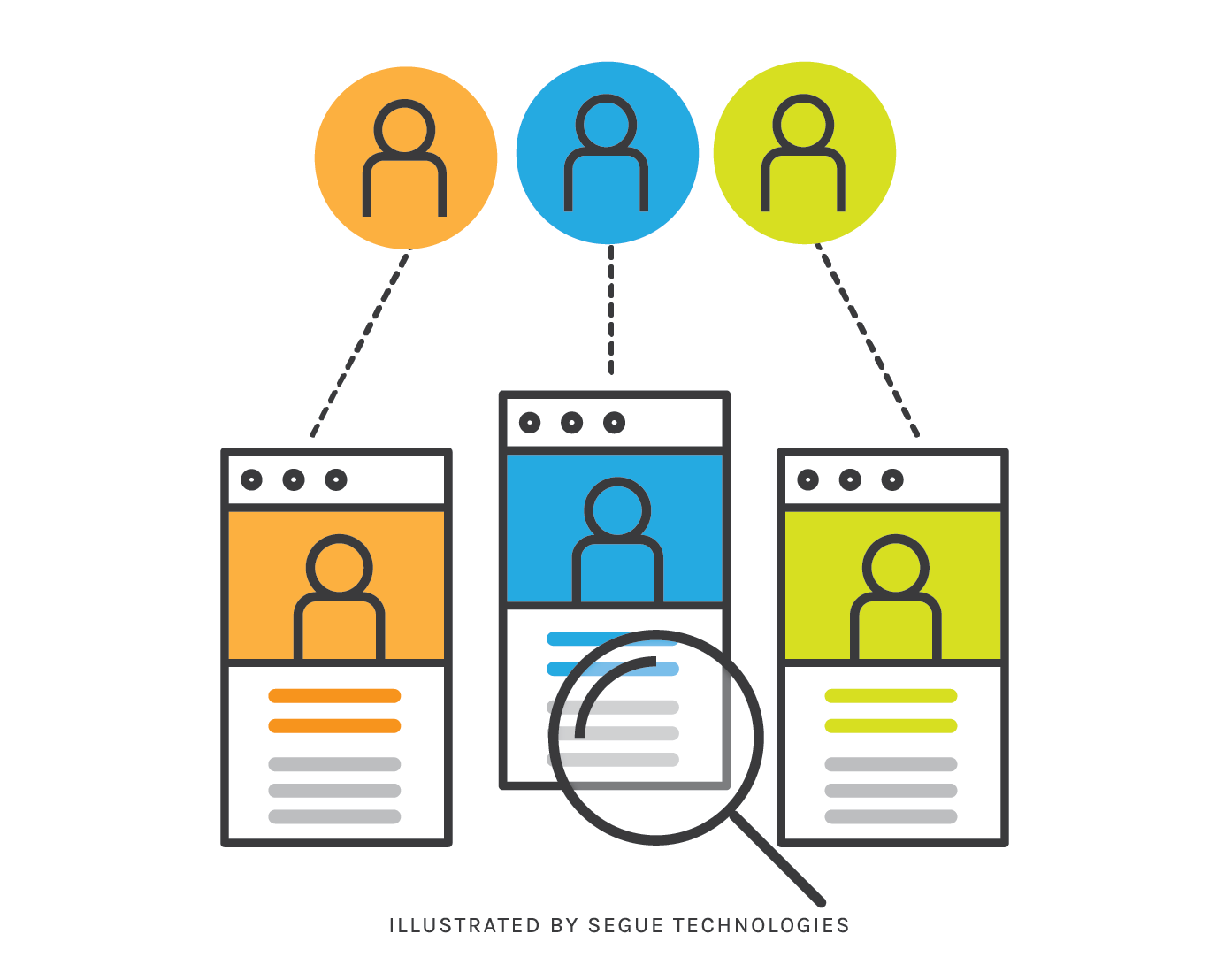
Prioritizing content will help you make informed design decisions when you’re ready to wireframe the site. We got down to the nitty gritty by creating six personas based on existing clients. Then we created typical scenarios for each user. Each task was unique to the user’s needs, and the steps to accomplish these tasks were tracked and later ranked by commonality across all the users. When you document the outcome, you can easily see the most critical and common tasks across the board. This determined the priority and placement of that information on the responsive site. In some cases, we even made some adjustments to the existing site. It’s a great time to make changes, and you already have the documentation to prove the need to make an update, so use it. In short, the more common the task, the easier we made the information to find on the mobile layouts. Yes, it’s that easy!

Lesson #3 – Wireframe, Wireframe, Wireframe!
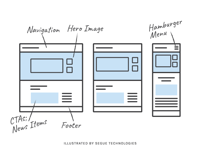
Now that you have your sections of content prioritized, you’re ready to start laying out the responsive design for each page using wireframes. The process is easier than it sounds. When you size down information, the possible ways it can appear on the screen become limited. You may have fifteen page templates for your current site, but in tablet form that reduces to ten, and on a phone, you end up with five possible layouts. For our team, the best way to track the content and ensure it was being translated to the responsive design was to break up the sections using colors to block out each area, then tag unique content on the page with a number. As the responsive designs are mocked up, we cross-referenced the content to ensure every piece was included, especially the content that needed to be pushed to the top of the page (according to our task analysis information).

Lessons #4 – Prototypes Are Helpful, but Auto-Generated Style Guides Are the Key to Transitioning Designs!
The next step is to provide direction to developers by way of the designs. This isn’t what it used to be; back in the day we would tediously lay out the pages for each breakpoint. Fortunately, software has come a long way and we have great programs that allow designers to build and export designs with specific information for developers to reference so they can quickly pull your vision together. We prefer using Sketch for our design hand-offs and it has helped tremendously. There are a lot of different programs out there, so you really need to find out what works best in your team before finding a good fit.
This approach to responsive design made adding additional bells and whistles to our webpage a smooth process and will ultimately result in delivering a better product to our users.
Good luck!